The e-commerce landscape is on the verge of retail domination. As we recover from the effects of the global pandemic, more smartphone users than ever before are tapping into an online high street to interact with their favourite brands.
In fact, by 2026 alone, one-fifth of retail purchases globally will be made with a click of a button.
Embarking on an e-commerce adventure could be the next big move for your small business. From opening your doors to a global audience to gaining recognition on social media, launching your store in an online domain could skyrocket your conversion rate in 2023.
What Are Site Developers Forgetting In 2023?
The question is, how do you get started? Thanks to web templates, YouTube guides, and competitor comparisons, It’s easier than ever before to build an online store. However, if you want your e-commerce venture to stand out of the crowd, it’s important to steer clear of the common mistakes made by web developers.
Stick with us as we reveal five common pitfalls of e-commerce web design and reveal how you can mitigate them in just a few simple steps.
Ignoring Competitor Data
It’s no secret that the e-commerce sector is competitive. Ranked as one of the key challenges online store owners face in 2023, competition between other industry players can make your journey to the top of Google all that bit trickier.
Alongside other common struggles, such as keeping up with user experience demands and boosting online visibility, staging on top of your competitors could be the difference between creating a store that pops or flops.
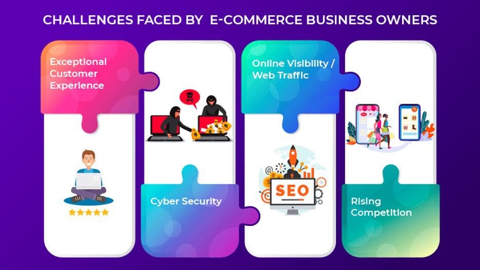

(Image Source: ZapBuild)
The key here is to delve deeper into competitor data before you embark on any site development. See what types of products your direct competition is selling, and note down how they have advertised them.
Better still, map how their store adapts to ever-changing demographic trends. Do they switch up their content depending on certain seasonal periods, or does their branding remain the same throughout?
Taking note of seasonal campaigns or the lack thereof could provide you with more ideas when creating your own store content. If your rival stores fall short of seasonal trend adaptations, ensure that your online store gives your target consumers what your competitor can’t.
Choosing a Poor Web Template
Once you’ve done your research, it’s time to start constructing the first draft of your e-commerce store.
Unless you’re a UX expert or a well-seasoned web developer, using a website template and a proper shop builder is your best bet when building an online store for the first time. Web templates are usually equipt with simple navigation guides and functional layouts but are still super easy to customise with your own visuals and colours.
However, it’s important to choose your web template carefully. Your web design not only drives engagement but can also be the number one reason a browser bounces. If you choose a template that is difficult to navigate or is overwhelming for a potential consumer, you’ll be likely to see little to no site traffic.
Choose a web template that is user-friendly, visually appealing, and professional in the eyes of your customers. Once you’ve selected a design that suits your individual needs, make sure you test it across a range of devices, ranging from smartphone screens to tablets.
In an era where 73% of consumers bounce off of a site due to poor design responsiveness, it’s crucial that your web template is multi-device functional as well as aesthetically pleasing.
Forgetting About Mobile Consumers
Did you know that 79% of e-commerce consumers now make a purchase via a smartphone device?
After 2022 raked in over $1 trillion in mobile sales alone, your smartphone shoppers are your ticket to success in 2023.


(Image Source: Outer Box Design)
Therefore, when building an online store, it’s imperative that you keep your mobile consumers in mind.
One of the most common mistakes made when constructing an e-commerce site is forgetting about the key differences between a desktop and mobile interface. While your online store may be functional on a desktop screen, with large visuals, horizontal text, and landscape navigation, styles quickly become dysfunctional in a mobile setting.
The key here is to create multiple versions of your site design. If you want to serve your mobile consumers with a responsive, user-friendly experience, ensure that your product photos are resized to avoid overlapping and that your content falls vertically to enhance a scrolling-based browning experience.
Better still, why not play around with haptic feedback? If you want to improve your site responsiveness, use vibrations, sounds, and visual guides for mobile consumers that provide feedback for each site action they perform.
“If you own an eCommerce website, it’s more important than ever to have an easy-to-use mobile shopping experience which includes a well-designed user interface along with blazing quick site speed,” claims Justin Smith, CEO of Outer Box Design. “Not doing so is simply ignoring half of your potential customers.”
Neglecting Customer Service Points
When constructing an online store, many developers focus solely on providing a functional route for leads to take from impression to checkout.
Yet, no consumer is the same. From different levels of accessibility to product-related questions not found in the site’s FAQ, there are a number of reasons why a consumer could need extra support during their shopping journey.
The key here is to start adding customer service points within your online store design. Whether you have the budget to leverage AI-powered chatbots or simply create a dedicated contact page that consumers can use to get in touch, building a customer support system on-site is a recipe for the positive feedback.
“We see our customers as invited guests to a party, and we are the hosts. It’s our job every day to make every important aspect of the customer experience a little bit better,” says Amazon’s CEO, Jeff Bezos.
After SalesForce data revealed that 89% of consumers are likely to repurchase on a site with easy-to-access customer service, it’s a site trick you don’t want to miss.
Overcomplicating The Checkout Process
Last but not least, it’s time to stop over-complicating the checkout process. Too many well-designed online stores lose their leads in the last few seconds on the grounds of a complicated checkout experience.


(Image Source: Fobes)
As you can see here, 17% of consumers abandon their carts at the last minute, based on a complicated checkout process alone.
If a consumer has added a product to their basket, the last thing they want to do is fill in a lengthy form and input all of their card details. Your checkout system should be packed full of options for each type of consumer.
We’re talking Apple Pay buttons, buy now, pay later schemes, and the ability to smartphone-scan card details. If you introduce steps that simplify and speed up the checkout process, you’ll be more likely to enjoy a higher rate of store conversions.
A Multi-Functional Future
Online store design is evolving. As the e-commerce sector expands, consumers continue to find new ways to tap into an online high street.
Therefore, it has never been more important to stay on top of your online store design. Not only should you be regularly adapting your content to adhere to demographic trends, but your store should strive to be multi-functional on a number of new devices.
“The goal of your e-commerce website design is to turn a casual browser into a loyal brand shopper,” says Tomas Laurinavicius co-founder of Best Writing. “UX design is an ever-evolving field. Develop new assumptions and design hypotheses, then test them on your site to develop a new “best practice” for your brand.”
Keep testing new strategies, and keep on top of your competitors in a fast-paced landscape. Those who prioritise their online store functionality will quickly see an ROI pay off, while those who fail to adapt to new consumer demands will find themselves fading on an online high street.




Leave a Reply
View Comments