Did you know that sites containing video content are 53 times more likely to rank at the top of a Google search? In the wake of a spike in online competition and an increase in consumer demand, prioritising site success is a must for businesses that want to do well.
The question is, could your video content be the key to victory? Not only has it been ranked as the most popular information vessel, but sites containing video content are much more likely to be shared and engaged with.
So, if you’re on a mission to boost your ranking position, optimising your video content could be the answer. However, like anything on your site, videos must be accessible, especially if you want your consumers to remain engaged. Stick with us as we delve into the fundamentals of video UX and reveal why it will play an important role in site success in 2023.
Why is video content so popular in UX design?
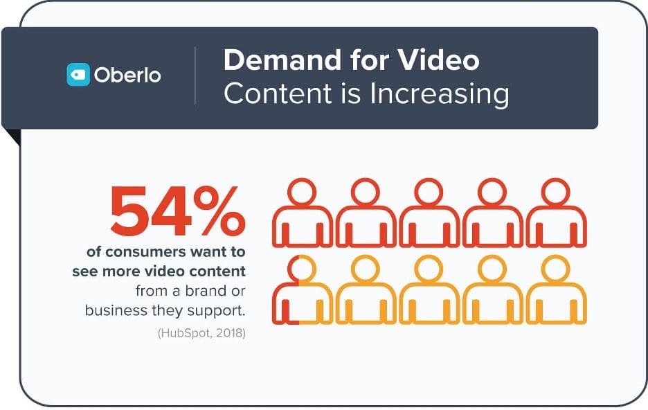
It’s no secret that the demand for video content is on the rise. In fact, experts at Oblero recently revealed that over half of modern consumers want to see more video content from a brand in 2022.


(Image Source: Oberlo)
From interactivity to immersion, video content immediately improves the consumer experience. As demands increase, users constantly crave new and exciting forms of content delivery, whether that be in the form of a video, animation or even a VR-based experience.
Better still, a whopping 79% of surveyed consumers revealed that they were convinced to purchase a product or service after engaging with a site video.
Thinking about the impacts of video content on your conversion rate alone is enough to get started on a video-based strategy, but what if we told you that optimised video content can also boost your site ranking too?
One key factor driving the popularity of video content is shareability. Videos generate 1200% more shares than images and text combined. Introducing more sharable content on your site not only improves the user experience but also increases a brand’s chances of showing up on social pages and the web. The more awareness your brand can build, the higher you’ll climb in terms of ranking.
So, where do we get started? We’ve established that video content plays a key role in site success, but how do we ensure it doesn’t also become the source of site downfall?
Like anything on your site, your video content must seamlessly slot into your UX design. From accessibility to compression, read on to find out how to prioritise your UX when it comes to creating video content.
How to optimise your videos for UX success
Pouring focus into perfecting your site’s user experience could see your conversions multiply in a competitive landscape. From accessible design to a fast-loading landing page, streamlining your user’s journey from the first click-through to the checkout is essential if you want to build a loyal following and brand credibility.
This applies to your video content too. If you want to enjoy its shareable and engagement-boosting benefits, your video content must have a quick call to action and of course, be optimised for mobile users too.
We’ve collated some simple, yet effective steps below that’ll see your video content thriving when it comes to providing the best user experience for your consumers.
Compress to boost loading speed
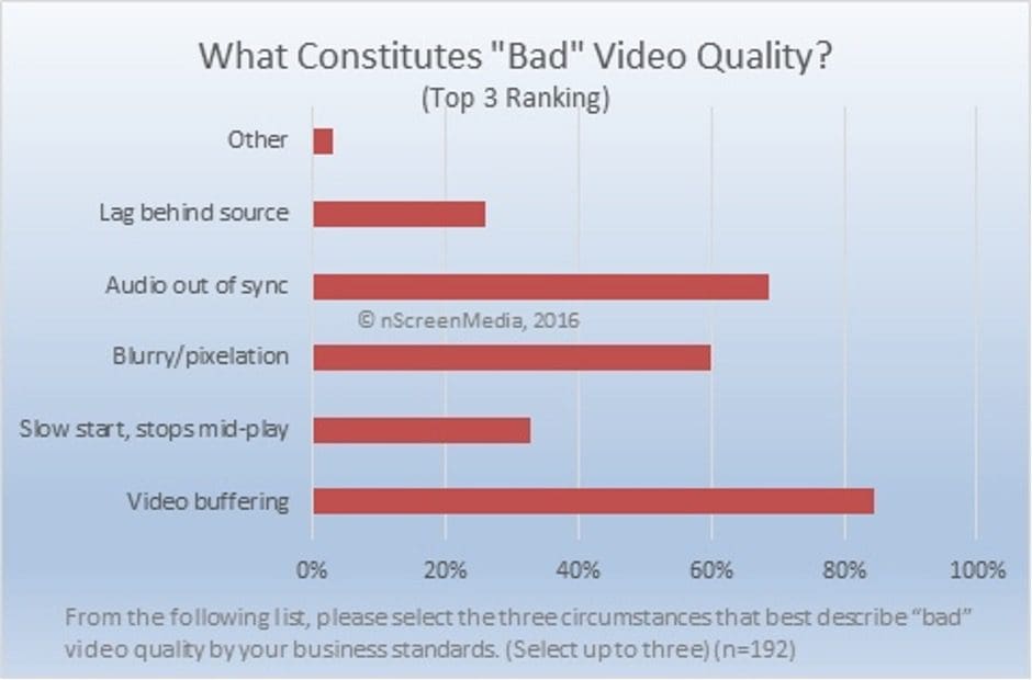
Did you know that 85% of business leaders rank video buffering as a key indicator of poor video UX?


(Image Source: NScreen Media)
When a video file is too large, site users will often find themselves falling victim to a loading wheel. With the average site user now expected to bounce in just 3 seconds, poor video loading times will see your site losing clicks.
High-quality video files may look appealing but can take up large amounts of site storage while putting pressure on a server’s bandwidth. In turn, a site slows down as it puts in more effort to run through reels of video data each time the content is engaged with.
The solution here is compression. Compressing a video still prioritises quality, while resizing a piece of content to reduce bandwidth pressure. Smaller files load faster, therefore prioritising a streamlined user experience.
The key here is to achieve a happy medium. Your content must still remain of high quality, especially when promoting professionalism, but your files should be compressed into an HTML5-supported format if you want them to load quickly.
Another way to boost video loading speed is to adjust the capabilities of your website server hosting. For brands and businesses dedicated to providing high-quality content, you’ll need to invest in a private or cloud-based server, that has a larger bandwidth and unlimited storage, perfect for streaming larger, high-quality videos.
Have a quick call-to-action
Your video content should be fresh and exciting in order to draw a consumer in, but it must also find a way to keep your user engagement with the site once the content has been consumed.
This is where content call-to-action comes into play. If you’re putting video content out onto your site, it should blend in seamlessly within your UX navigation strategy. Your video should guide your user to the next stage of the conversion funnel.
Whether that be encouraging them to engage with a product page or sign up for more information, a call to action is essential in keeping your consumer engaged on-site.


(Image Source: Vidyard)
As you can see here, this example of a video call to action from Healthcare Recruiters International provides a signup call to action at the side of their video content, in order to accompany the information received in the content. This is a clever way to use your video strategy to guide the consumer to the next steps on your site.
Optimise for mobile users
Over half of all internet traffic is now attributed to a mobile device. This means that forgetting your mobile users is no longer an option when designing your site’s UX strategy.
From shifting accessibility needs to optimising simpler navigation systems, there are many ways to improve your mobile UX.
Video content is no exception to the rule. Mobile video players require a much simpler design. Unlike larger screens, mobile devices have less room to add a multitude of controls. In fact, overloading a mobile site with strings of content, buttons and calls-to-action can actually increase loading times and cause your consumers to bounce.
Instead, you must prioritise mobile UX essentials, such as the ability to enter full-screen mode and pause the video with just the tap of a finger.
Better still, why not include UX shortcuts to improve the mobile user experience. Shortcuts such as the 10-second double tap skip, often seen on popular video platforms such as YouTube, can allow a mobile user to skim through video and identify the information they are looking for. Adding mobile savvy functionally to your video UX strategy could be your key to winning over a smartphone audience.
Prioritise interactivity
Last but not least, your video content must prioritise interactivity if you want to enjoy UX success. Users are more tech-saavy than ever before. In the wake of the pandemic’s digital shift, they now demand higher levels of content interactivity and personalisation, especially in an age where they can jump to a competitor site in seconds.
Your videos must be packed with fresh, consumer-driven content, especially if you’re looking to boost engagement. The key here is to think outside of the box.
One brand paving the way forward for video UX is Feel Unique. Turning their regular product videos into a shoppable experience for site visitors, the beauty brand is prioritising interactivity.


(Image Source: Feel Unique)
Using a Smartzer interactive video platform, Feel Unqiue have created product content that users can interact with and customise while consuming information about their favourite beauty products.
Not only has this boosted site engagement by 40%, but the beauty brand has seen their conversions skyrocket in repsosnse to prioritising their user’s experience.
The UX strategy of tomorrow
As we step into the UX design of tomorrow, video content will continue to be at the centre of its success.
With the demand for video content growing amongst a social-media driven generation, it has never been so important for marketers to start prioritising their video optimisation.
From accessibility to interactivity, video content of tomorrow must be fresh, exciting and aimed at a mobile consumer for a brand’s best shot at UX victory.


Leave a Reply
View Comments